


-
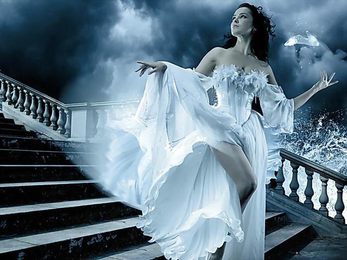
Hoy es un buen día, nadie sabe si tu alma te llevará por el camino del amor y conozcas a tu príncipe azul.

<div style="padding-right: 10px; padding-left: 10px;">
<div style="padding: 3px; width: auto; height: 100%; box-shadow: 0px 2px 10px black; border-radius: 10%/7%; border: 1px solid #fff; background-image: url('https://lh3.googleusercontent.com/Il20QZV-tGyfDUtmuWTPxP_oTLDj9UUe5ybB9DVyD7L2=s100-no'); <!--?php //© 220761 ?--> background-repeat: repeat;">
<div style="padding: 9px; width: auto; height: 100%; border-radius: 10%/7%; box-shadow: inset 0px 0px 10px #000000; border: 1px dotted #; background-image: url('https://img-fotki.yandex.ru/get/2814/96945866.bc/0_86abf_95a8e870_S');">
<div style="padding: 2px; width: auto; height: 100%; border-radius: 10%/7%; border: 3px dotted #fff; background-image: url('https://lh3.googleusercontent.com/Il20QZV-tGyfDUtmuWTPxP_oTLDj9UUe5ybB9DVyD7L2=s100-no'); <!--?php //© 300452 ?--> background-repeat: repeat;">
<div style="border-radius: 10%/7%; height: 100%; box-shadow: inset 0px 0px 10px #000000; border: 1px dotted #94627f; background-image: url('https://lh3.googleusercontent.com/gB4D5dENa5j3VP58BS2_Q-LPKaKqlit1-qeSV9veBs9M=w163-h188-no');">
<div style="padding: 2px;">
<div style="padding: 1px; height: 100%;">
<div style="padding: 60px;">
<div style="padding: 3px; width: auto; height: 100%; border-radius: 7%; border: 1px solid #fff; background-image: url('https://lh3.googleusercontent.com/1ZGsaj4ik7cdDBgyusmyD4O8dfKjv21xqhdn2TH83l5C=s150-no'); <!--?php //© 220761 ?--> background-repeat: repeat;">
<div style="padding: 9px; width: auto; height: 100%; border-radius: 7%; box-shadow: inset 1px 1px 5px #000000; border: 0px dotted #fff; background-image: url('https://img-fotki.yandex.ru/get/2814/96945866.bc/0_86abf_95a8e870_S');">
<div style="padding: 2px; width: auto; height: 100%; border-radius: 7%; border: 3px dotted #fff; background-image: url('https://lh3.googleusercontent.com/1ZGsaj4ik7cdDBgyusmyD4O8dfKjv21xqhdn2TH83l5C=s150-no'); background-repeat: repeat;">
<div style="border-radius: 7%; -webkit-box-shadow: inset 3px 3px 10px 10px rgba(112,108,112,1); -moz-box-shadow: inset 3px 3px 10px 10px rgba(112,108,112,1); box-shadow: inset 3px 3px 10px 10px rgba(112,108,112,1); height: 100%; border: 1px dotted #fff; background-image: url('https://img-fotki.yandex.ru/get/40/96945866.c0/0_86b80_1a9beeef_S');">
<div style="padding: 2px;">
<div style="padding: 1px; height: 100%;">
<p style="text-align: center;"> </p>
<p> </p>
<div class="stack twisted"><img src="http://img0.liveinternet.ru/images/attach/c/7/94/769/94769138_fantasy_girls_1755.jpg" alt="" width="323" height="283" /></div>
<style type="text/css"><!--
.stack { position: relative; z-index: 10; }
/* Image styles */
.stack img { max-width: 100%; height: auto; vertical-align: bottom; border: 5px solid #fff; border-radius: 17%;
-webkit-box-sizing: border-box;
-moz-box-sizing: border-box;
box-sizing: border-box;
-webkit-box-shadow: 0 1px 4px rgba(0, 0, 0, 0.4);
-moz-box-shadow: 0 1px 4px rgba(0, 0, 0, 0.4);
box-shadow: 0 1px 4px rgba(0, 0, 0, 0.4);
}
/* Stacks creted by the use of generated content */
.stack:before, .stack:after { content: ""; border-radius: 17%; width: 323px; height: 243px; position: absolute; border: 10px solid #F7F3F7; left: 0;
-webkit-box-sizing: border-box;
-moz-box-sizing: border-box;
box-sizing: border-box;
-webkit-box-shadow: 0 1px 4px rgba(0, 0, 0, 0.4);
-moz-box-shadow: 0 1px 4px rgba(0, 0, 0, 0.4);
box-shadow: 0 1px 4px rgba(0, 0, 0, 0.4);
-webkit-transition: 0.3s all ease-out;
-moz-transition: 0.3s all ease-out;
transition: 0.3s all ease-out;
}
.stack:before { top: 4px; z-index: -10; } /* 1st element in stack (behind image) */
.stack:after { top: 8px; z-index: -20; } /* 2nd element in stack (behind image) */
/* Third stack example (One stack element rotated in the opposite direction) */
.stack.twisted:before {
-webkit-transform: rotate(4deg);
-moz-transform: rotate(4deg);
transform: rotate(4deg);
}
.stack.twisted:after {
-webkit-transform: rotate(-4deg);
-moz-transform: rotate(-4deg);
transform: rotate(-4deg);
}
/* Reset all rotations on hover */
.stack:hover:before, .stack:hover:after {
-webkit-transform: rotate(0deg);
-moz-transform: rotate(0deg);
transform: rotate(0deg);
}
--></style>
<br /><br />
<p><embed style="position: absolute; width: 360px; height: 330px; left: 230px;" type="application/x-shockwave-flash" width="420" height="360" src="http://xuanfei.cctv118.com/2009fla/114.swf" wmode="transparent" allowscriptaccess="never"></embed></p>
<p> Texto</p>
<p><em><strong><br /><br /><a href="http://firepic.org/" target="_blank"><img style="display: block; margin-left: auto; margin-right: auto;" src="http://img0.liveinternet.ru/images/attach/c/7/94/648/94648112_0_720c4_b9a5c47b_L.png" alt="" width="213" height="32" /></a></strong></em> <em><strong><br /></strong></em></p>
<p> </p>
<div style="margin: 0px; padding: 0px; width: 100px; height: 60px; z-index: 100;"><br /><a style="padding: 0px; margin: 0px; border: none;" href="http://preloaders.net/ru/letters_numbers_words" target="_blank"><img title="Generador de texto animado" src="http://s5.rimg.info/86d30c5f660ce7d7ebc5fb44dc634b27.gif" border="0" alt="Generador de texto animado" width="22" height="22" /></a><br /><br /><br /><a href="http://preloaders.net/ru/letters_numbers_words" target="_blank"></a></div>
<br /> </div></div></div></div></div></div></div></div></div></div></div></div></div></div>
-

-

Numquam renuntiabit
<a href="http://tutorialgloriav.eklablog.com/"
 target="_blank"><img src=
"http://ekladata.com/cEEYfZtSNwWA8Pt7k--C97p7qFs/34.gif"
alt="" width="120" /> -
Con mucho gusto y
gran placer os
presentó mi ayudante
-
"No puedes enseñárselo todo: sólo puedes ayudarle a encontrarlo por sí mismo."
Galileo Galilei y

-
Vivir en armonía con el universo es vivir lleno de alegría, amor y abundancia.
Shakti Gawain -

-
-


-

GloriaV666@gmail.com


 Créer mon blog